Paper Stock Guide: Matte, Gloss, Soft-Touch and Recycled, Explained
Two businesses can print the exact same design, on the exact same printer, and end up with two completely different-feeling pieces of paper. The difference isn't the artwork, it's the stock. Matte, gloss, soft-touch and recycled aren't just visual options, they change how something feels in the hand, how it photographs, how it ages, and even what it quietly says about the business behind it before anyone reads a word.
Most people default to whatever finish a template suggests, or whatever the printer defaults to, without realising there's an actual decision to be made. This guide walks through what each of these four stock options actually is, how they compare, and how to think about choosing between them for your next print run.
First, a Quick Note on What "Stock" Means
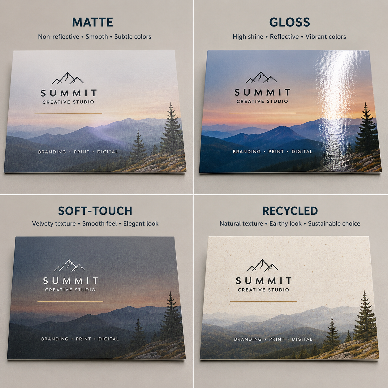 Before getting into the four options, it's worth separating two things that often get talked about as one: paper weight and paper finish.
Weight, measured in GSM (grams per square metre), is about thickness and rigidity, a 300gsm card feels sturdier than a 130gsm flyer, regardless of finish. Finish is a separate layer, coating or texture applied to the paper's surface, and it's what this guide is actually about. You can have a gloss finish on a light or heavy stock, a matte finish on either, and so on. The two decisions, weight and finish, are independent of each other, even though people often talk about them as if choosing one automatically decides the other.
With that separated out, here's what each finish actually does.
Matte: The Understated Default
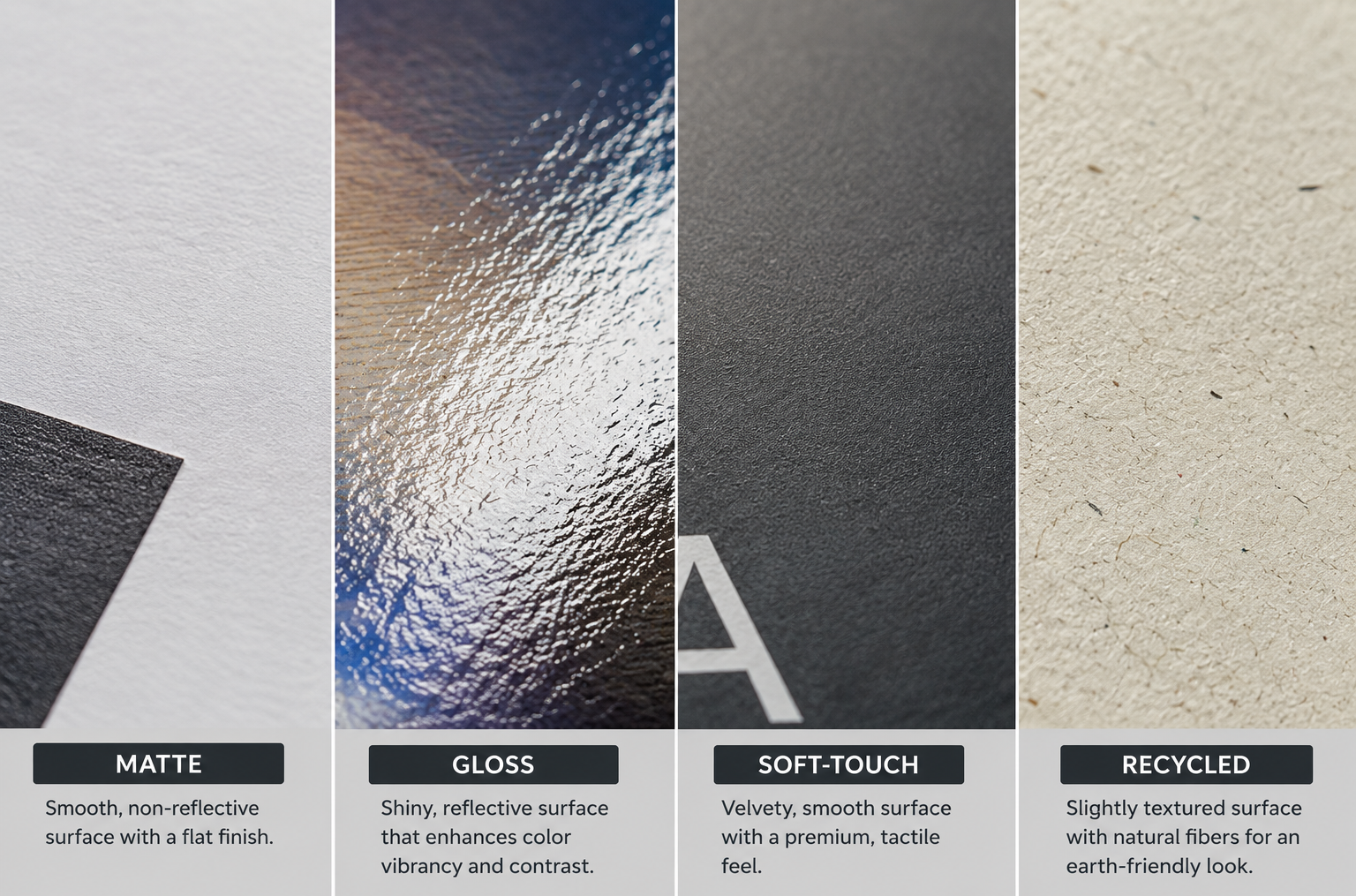
Matte finish is a flat, non-reflective coating applied over the printed surface. Under normal light, it shows no glare, colours read as slightly muted compared to gloss, and text stays sharp and legible from almost any angle.
How it's made: A thin matte laminate or varnish is applied over the printed sheet, sealing the ink without adding shine.
What it's best for: Anything that needs to be read easily and handled often. Text-heavy brochures, reports, letterheads, and business cards that get pulled out of a wallet multiple times a day all benefit from matte's resistance to glare and fingerprints. It's also the most forgiving finish for photography, matte surfaces don't create the reflective hotspots that gloss can under studio or phone camera lighting.
What it isn't great for: Matte doesn't make colours pop the way gloss does. If the entire point of a piece is vivid, saturated colour, a product catalogue with bright photography, for instance, matte can make it look slightly flatter than intended.
The impression it creates: Understated, professional, easy to trust. Matte rarely reads as cheap, but it also rarely reads as flashy. It's the finish that gets out of the way and lets the content do the work, which is exactly why it's the most common default across almost every printed product category.
Gloss: Vivid, Reflective, Attention-Grabbing
Gloss finish is the opposite approach: a shiny, reflective coating that makes colours appear more saturated and vibrant than the same ink would look under matte.
How it's made: A high-shine laminate or varnish is applied over the print, similar in process to matte but formulated to reflect rather than diffuse light.
What it's best for: Photography-heavy pieces where colour vibrancy matters more than glare-free readability, product catalogues, restaurant menus with food photography, retail packaging. Gloss makes reds redder and blues bluer in a way matte simply can't replicate.
What it isn't great for: Text-heavy documents, anything that will be photographed or scanned under strong light, and anything that gets handled frequently. Gloss shows fingerprints and smudges far more visibly than matte, and the glare it produces can genuinely make text harder to read at certain angles.
The impression it creates: Bold, vivid, commercial. Gloss reads as more "retail" than matte, it's the finish most associated with consumer products and point-of-sale material rather than corporate stationery. That's not a downside, it's simply a different register, appropriate for different contexts.
Soft-Touch: The Finish You Feel Before You Read
Soft-touch (sometimes called velvet lamination) is a textured, matte-like coating that adds a distinct tactile quality to the paper's surface, closer to suede or velvet than standard paper.
How it's made: A specialised laminate film, textured rather than smooth, is applied over the print. It's a more involved lamination process than standard matte, which is part of why it typically costs more.
What it's best for: Anything where the physical experience of holding the piece is meant to be part of the impression, premium business cards, boutique retail packaging, invitations, hospitality menus and folders. Soft-touch is a finish people notice with their hands before their eyes even process the design, and that reaction is difficult to replicate any other way.
What it isn't great for: High-frequency handling. Soft-touch shows fingerprints, oil marks and light scuffing more visibly over time than standard matte, so it suits pieces that get handed over occasionally and kept, rather than pulled out of a pocket dozens of times a day. It's also not a natural fit for dense, text-heavy layouts, the tactile quality is most effective on simpler, more spacious designs.
The impression it creates: Deliberate, premium, considered. Soft-touch is rarely the default choice, which is exactly why it stands out when it's used. It signals that a business thought about the physical object, not just the design on it.
Recycled: The Sustainability-Forward Choice
Recycled stock is paper manufactured wholly or partly from post-consumer or post-industrial recycled fibre, rather than fresh wood pulp. It's less a "finish" in the coating sense and more a material choice, though it's grouped here because it's just as often the deciding factor in a stock decision as matte, gloss or soft-touch.
How it's made: Recycled paper fibre is reprocessed from used paper products, de-inked, pulped, and reformed into new sheets. Depending on the grade, recycled stock can be 30% recycled content up to fully recycled, and quality has improved significantly over the past decade, modern recycled stock is far less visibly "recycled-looking" than it used to be.
What it's best for: Any business where sustainability is part of the brand story, or where a client or audience actively values it. Recycled stock has become common well beyond niche eco-brands, corporate stationery, event materials, and packaging inserts across many industries now default to recycled options as standard practice rather than a special request.
What it isn't great for: If maximum print vibrancy or a very smooth, premium-feeling surface is the priority, recycled stock (particularly uncoated recycled grades) can look and feel slightly less polished than virgin coated stock. This gap has narrowed substantially with better recycling processes, but it hasn't disappeared entirely at the highest end.
The impression it creates: Conscious, responsible, increasingly mainstream rather than niche. A visible recycled texture or slightly off-white tone reads as an intentional choice now, in a way it might have read as a compromise a decade ago.
Comparing the Four
| Matte | Gloss | Soft-Touch | Recycled | |
|---|---|---|---|---|
| Feel | Smooth, flat | Smooth, shiny | Textured, velvet-like | Varies, often slightly coarser |
| Colour vibrancy | Muted | High | Muted | Varies by grade |
| Fingerprint resistance | High | Low | Low-medium | Varies |
| Best for | Text-heavy, everyday handling | Photography, retail | Premium, occasional handling | Sustainability-led branding |
| Relative cost | Standard | Standard | Higher | Standard to slightly higher |
None of these four are strictly "better" than the others, they solve different problems. The mistake isn't choosing gloss over matte or matte over soft-touch, it's choosing without asking what the piece actually needs to do once it leaves the press.
How to Choose: Three Questions Worth Asking?
How often will it be handled? Frequent handling favours matte or gloss, both of which are more resistant to visible wear than soft-touch. Occasional handling, where the piece is meant to be kept and remembered, is where soft-touch earns its higher cost.
What's the content? Photography-heavy material benefits from gloss. Text-heavy material benefits from matte. Simple, focal designs, a logo, a short message, work well on soft-touch, where texture rather than colour carries the impression.
Does the audience care about sustainability? If the answer is yes, or even "possibly," recycled stock is worth defaulting to rather than treating as a special request. The quality gap has closed enough that it's rarely a meaningful trade-off anymore, and it removes a question the audience might otherwise be asking themselves.
Common Mistakes
Choosing gloss for text-heavy documents. The glare genuinely makes dense text harder to read, particularly under fluorescent office lighting. Gloss belongs on photography and colour, not paragraphs.
Assuming soft-touch suits everything premium. Soft-touch is premium in feel, but it's not automatically the right premium choice. A dense, information-heavy annual report doesn't benefit from the same tactile treatment that a simple, logo-forward business card does.
Treating recycled stock as a downgrade. This assumption is increasingly outdated. Modern recycled stock, at reasonable grades, holds up well against virgin stock in most everyday applications, and the sustainability signal it sends often outweighs any minor difference in surface polish.
Not testing before a large run. Finish and stock choices are hard to judge from a screen. A small proof run, even just a handful of sheets, catches surprises, an unexpected texture, a colour that reads differently on matte than expected, before they're multiplied across a few thousand units.
Frequently Asked Questions
Can I mix finishes within the same print job? Yes, in most cases. It's common to print, for example, a matte brochure body with a gloss or soft-touch cover, or business cards where part of a team gets one finish and another part gets a different one, depending on the printer's setup.
Is recycled paper more expensive than standard stock? Not necessarily. Pricing varies by grade and supplier, but many recycled options now sit close to standard stock pricing, particularly at the coated, mid-range grades most businesses use.
Which finish lasts longest without visible wear? Matte and gloss both resist visible wear better than soft-touch over frequent handling, since soft-touch's textured surface shows oil and fingerprints more readily.
Do I need to choose one finish for my whole brand? No. Many businesses use different finishes for different materials intentionally, matte for internal documents, soft-touch for client-facing premium pieces, gloss for retail packaging, based on what each piece needs to do.
Closing
The right paper stock isn't the most expensive one or the most unusual one, it's the one that matches how a piece will actually be used and what it's trying to communicate. Matte for legibility and everyday handling, gloss for vivid photography, soft-touch for a deliberate, premium first impression, recycled for a sustainability story that's increasingly the default rather than the exception. Once you know what a piece needs to do, the stock choice tends to answer itself.